One Season Isn't Enough: Revisiting Run Diff vs. Win% with 5 Years of Data
Last time I calculated r using 30 teams from the 2025 MLB season. The answer was 0.95 — "very strong positive correlation."
But something nagged at me.
We only had 30 data points. Maybe 2025 just happened to be an unusually clean year. Would 2024 look the same? Would 2023? Or was r = 0.95 a one-season fluke?
There's one way to find out. Get more data.
What Happens When Your Sample Is Small
Flip a coin 10 times and get 7 heads. Can you conclude "heads comes up 70% of the time"?
No. 10 flips tell you nothing. Do it again and you might get 4 heads, or 6. To judge whether the coin is fair, you need hundreds of flips.
Data analysis works the same way. r = 0.95 from 30 teams in one season is "the answer for those 30 points." To claim it's the answer for MLB as a whole, you need more data.
More is better. But more isn't always better on its own — which data you add matters too.
Why 2020 Has to Go
The easiest way to get more data is "grab the last few seasons." But there's a trap here.
MLB's 2020 season ran just 60 games instead of the usual 162. COVID cut it to a third.
Why does that matter? Run differential is "runs scored minus runs allowed over the whole season." A 162-game year swings between ±200, but a 60-game year lives around ±60. The axes are on totally different scales.
Mixing them directly pulls 2020 into a cluster near the origin, with a completely different distribution from other seasons. The math of r still works, but visually and interpretively you're mixing apples and oranges.
So I dropped 2020. Instead, I'm using 2021–2025, five seasons, 150 data points — all full 162-game seasons.
The lesson: "more data is always better" isn't always true. You have to mix data measured under the same conditions.
Five Seasons on One Plot
I put all 150 team-seasons on a single scatter plot, coloring each season differently.
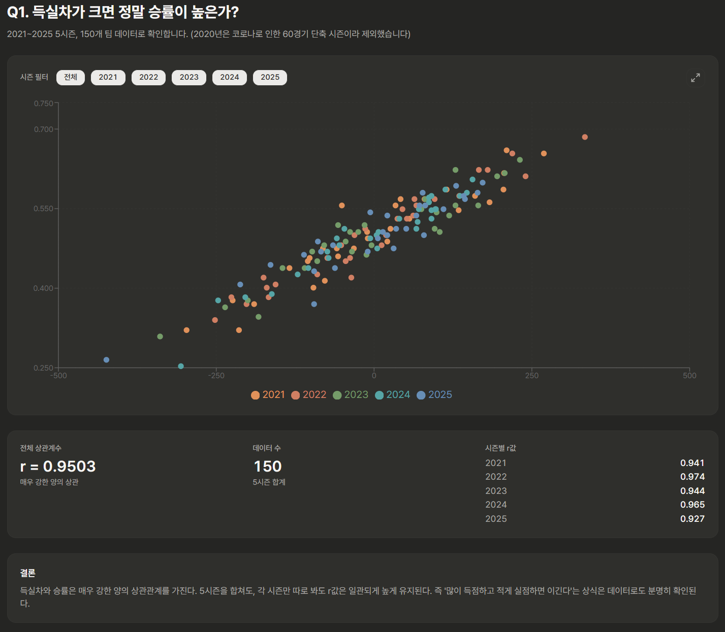
The colors are mixed in, but every season flows in the same pattern. No year stands out as "playing by different rules." Five times the points, same shape.
What Do the Numbers Say?
Enough eyeballing. Here's the real question.
How did r change?
I lined up the overall r from all 150 points alongside each season's own r.
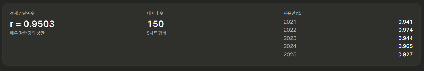
No surprises.
- Overall r: stays in the high 0.9s — basically identical to what we got from 2025 alone.
- Per-season r, five of them: all above 0.9. It wasn't 2025's lucky year.
The "is 30 teams really enough?" unease from last time? Resolved by 5x the data. It wasn't a one-season phenomenon — it's a structural relationship that shows up every year.
What "r Didn't Move" Actually Means
One thing worth pausing on. r not moving isn't just "we got lucky."
If the relationship were actually weak, combining seasons would make r wobble. One season at 0.95, another at 0.6, and the combined number settling somewhere in the middle.
But every season's r is north of 0.9, and the combined r is also north of 0.9. That means this relationship is structurally baked into MLB baseball. Teams change, players change, rules shift a little — but the team that scores more and allows less still wins.
Does that sound too obvious? The point isn't that the answer is surprising. The point is that we confirmed it with numbers. Data analysis is often about checking common knowledge. Confirming it's right is a result. Finding out it's wrong is a result. Both are wins.
What About Outliers?
Among the 150 points there are a few that stick out.
- Low run differential, above-average winning percentage → teams that won a disproportionate share of close games, or just got lucky.
- High run differential, disappointing winning percentage → teams that got burned in close games instead.
These points drag r down. The fact that r is still above 0.9 means the other ~142 teams are lined up so tightly that a handful of outliers can't move the number much.
Outliers are interesting on their own. "Why was that team's record so out of sync with its run differential?" is a whole analysis of its own. But that's a question for another day.
One Question Closed, Another Opens
Now we can answer the question from post 1 with confidence.
Does a bigger run differential really mean a higher win rate?
Yes. Confirmed across 5 seasons and 150 teams. Run differential and win rate have a very strong positive correlation (r ≈ 0.9x), and this relationship holds consistently every season.
But a new question pops up.
Does run differential cause winning percentage, or do they just move together? You've probably heard that correlation isn't causation. Does 0.95 mean "run diff creates wins," or does it mean "both are driven by some hidden thing called team quality"?
That's what the next post is about.
This analysis was done with just-mlb, a tool I built. Want to see the 5-season scatter and per-season r values yourself? Check it out.